In the realm of data representation, Venn diagrams stand as invaluable assets, adept at visually elucidating relationships and intersections within diverse sets of data. Offering a swift and effective method, these diagrams become the artistic brushstrokes that paint a vivid picture of similarities and differences across various categories or groups. This blog post is dedicated to delving into the advantages of harnessing Venn diagrams for data visualization, guiding you through the process of utilizing a Venn diagram template to craft comparisons that are both compelling and easily comprehensible. Prepare to unravel the power of visual storytelling through the lens of Venn diagrams.
Understanding Venn Diagrams
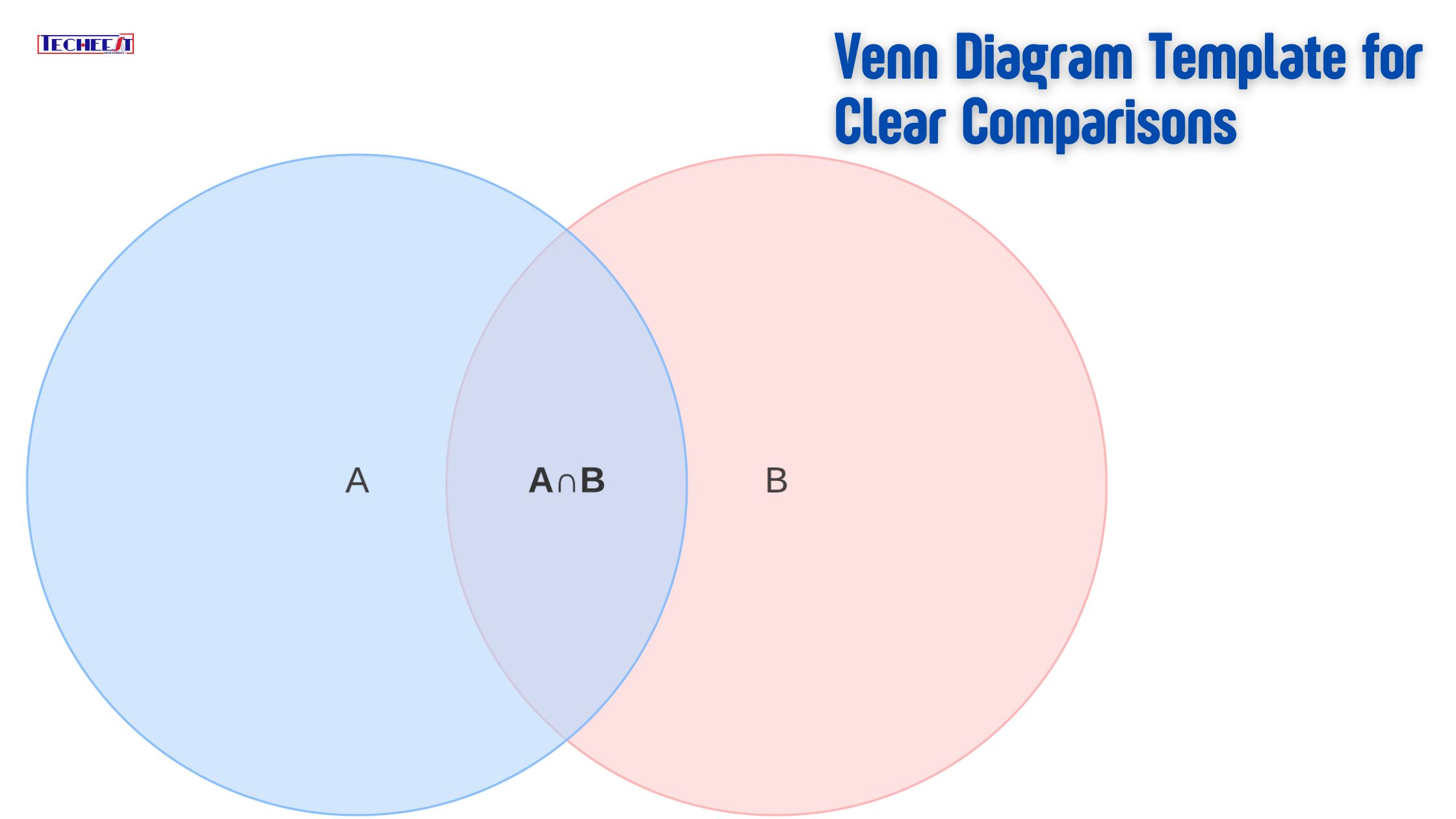
In the visual realm, a Venn diagram stands as a graphical representation of sets, often manifested through overlapping shapes or circles. Each circle serves as a symbolic representation of a distinct set or category, while the shared elements between sets find expression in the overlapping areas. Conversely, the non-overlapping sections delineate the unique components specific to each set.
Venn diagrams find widespread utility in spotlighting both the commonalities and distinctions among various data points. They serve as illustrative tools, unraveling intricate relationships across a spectrum of fields, encompassing marketing, statistics, business, and mathematics. With their capacity to distill complexity into a visually comprehensible format, Venn diagrams emerge as indispensable instruments for highlighting nuances in data analysis and elucidating relationships in diverse domains.
The Benefits of Using Venn Diagrams
In the realm of data visualization, Venn diagrams emerge as highly useful and advantageous tools, characterized by their distinctive design comprising overlapping circles. This unique structure simplifies the representation of complex information, rendering it more understandable and intuitive. Let’s delve into the benefits of harnessing Venn diagrams, focusing on their ability to provide visual clarity, streamline comparisons, and enhance communication.
Visual Clarity:
One of the primary advantages of Venn diagrams lies in their innate ability to offer visual clarity. The use of overlapping circles facilitates the depiction of intricate relationships among various data sets. This approach proves highly effective in conveying complex information in an easily comprehensible manner. Viewers can swiftly identify connections and understand intersections, making the data more accessible and user-friendly.
Easy Comparison:
Venn diagrams excel in simplifying the comparison of multiple sets. The non-overlapping sections draw attention to the distinctive qualities of each set, while the overlapping regions serve as visual cues of similarities. This dual functionality proves invaluable in illustrating both parallels and differences, enabling audiences to quickly and fully grasp the content. It becomes a practical and efficient technique for visualizing relationships within datasets.
Effective Communication:
Beyond their role in data visualization, Venn diagrams stand as useful tools for efficient communication, whether integrated into reports, infographics, or presentations. Their visual component simplifies complex ideas into visually appealing elements, injecting an engaging dimension into data presentation. This proves especially beneficial when dealing with intricate information that could be challenging to express solely through oral or written means. Venn diagrams, therefore, emerge as facilitators of effective and impactful communication across various contexts.
Using a Venn Diagram Template
Creating a Venn diagram from scratch, especially when dealing with a sizable dataset, can be a challenging and time-consuming task. Opting for a Venn diagram template not only ensures accuracy and consistency in your visualizations but also streamlines the entire process.
Typically, a Venn diagram template comprises pre-made circles or shapes that can be easily customized with your specific data, catering to your unique requirements. This convenience makes these templates accessible to both seasoned professionals and beginners. Whether sourced online or through data visualization software, the availability of diverse Venn diagram templates simplifies the creation process and allows users to effortlessly adapt them to their datasets. This user-friendly approach ensures that individuals, regardless of their level of expertise, can leverage Venn diagram templates as effective tools for visualizing complex relationships in a time-efficient manner.
Step-by-Step Guide to Using a Venn Diagram Template
- Select a Template: Depending on how many data sets you wish to compare and your needs, choose a Venn diagram template.
- Enter Data: Enter your own information in place of the template’s placeholder labels. Ensure that the overlapping areas correspond to the shared elements, and that each circle represents a distinct data set.
- Customize Appearance: Make the Venn diagram’s colors, font choices, and general layout unique to your presentation or branding.
- Review and Edit: Verify that the Venn diagram appropriately depicts the relationships you wish to see visualized by double-checking your data inputs.
Once you are happy with the Venn diagram, share it by exporting it to a format that works with your report or presentation. To effectively communicate your message to your audience, share your visualizations with them.
Conclusion
In the realm of data visualization, Venn diagrams stand out as crucial tools, offering a means to simplify intricate relationships and comparisons, making them more accessible and comprehensible. Whether you’re unveiling research findings, dissecting survey data, or juxtaposing market segments, the utilization of a Venn diagram template emerges as a valuable strategy, streamlining the process and enhancing the visual impact of the data.
Experimenting with Venn diagrams provides firsthand insight into their efficacy in conveying information. Their role extends beyond mere presentation; they become instrumental in data-driven decision-making, aiding in the extraction of meaningful insights. Furthermore, their ability to elucidate concepts that overlap fosters a deeper comprehension, making them indispensable tools for anyone navigating the complexities of data analysis and interpretation. Incorporate Venn diagrams into your toolkit and witness how they not only simplify the communication of information but also contribute to informed decision-making and a more profound understanding of interconnected concepts.